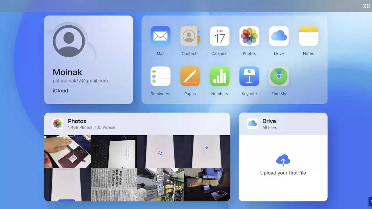
Apple has revamped the appearance of its iCloud.com to make the website feel more noticeable and contemporary. With the addition of widget-like tiles that display information from images, notes, mail, and other sources. According to reports, it’s a significant improvement over the previous website, which essentially merely displayed a few symbols that served as links to web apps. Anyone who frequently needs to access their iCloud data from a browser rather than an app on an iPhone or Mac should like the update.
With the new design, you can customize your iCloud.com homepage which was made available to beta testers last month. You can add tiles that can show your most recent pictures, emails, documents, calendar events, notes, and more. If you click the tick circle next to a reminder, you’ll only be directed to the Reminders web app, exactly like with most iOS widgets, so you’ll still need to open the applications if you want to do anything with that information. The reminder you clicked will show you where the list is located, but to really mark the action as finished when the online app runs, you must click the circle once again.
With this new look, it’s convenient to be able to see certain crucial information quickly and to have some control over what information the home page prominently displays. A nice example of how they formerly appeared is provided by this PCMag article. The websites that allow you to update your iCloud account settings from a browser have also undergone some cosmetic changes.
Although there are no ground-breaking new features on the site that significantly expand what users can accomplish with it. The iCloud versions of programs like Pages and Numbers get updates on their own schedule and largely retain their previous usability. However, for anyone who frequently needs to utilize such online apps, using them through iCloud.com should suddenly be a little more pleasant.

